Transitional Kitchen Remodel
The Inspiration
The client was referred to us by a contractor that our designer had worked personally with for many years, coming prepared with numerous inspirational photos that she wanted to incorporate into her new kitchen and overall remodel. The style she wanted to draw on was clean line, transitional, simple, and functional to accommodate her busy family with young children. Completed by our great partner builder Brian Yanke.
Making Room
The client had a very small back entry and really needed to expand the mudroom space to increase storage and organization of her growing family. The goal was to add lockers into the mudroom hallway between the garage and the kitchen, as well as to move the wall between the laundry and kitchen to expand the overall kitchen floor plan.
As a part of that request, she wanted to move the washer, dryer, and sink upstairs, which posed a challenge of reconfiguring the upper level bathroom and bedroom space of her home. In addition, she asked to move the back powder room to where the back closet was on the main level in order to put a washing sink close to the backyard door for her boys to wash their hands as they entered the home.
Not only did she ask to move aspects of her home around, but she also wanted to add certain specific appliances, such as a built-in coffee machine and new built in microwave to the space for convenience and functionality. This posed a challenge due to the nature of the ventilation system of the coffee machine she wished to install, as it was extremely complicated to accommodate all of the hookups it required to be fully serviceable.


Reinventing the Kitchen
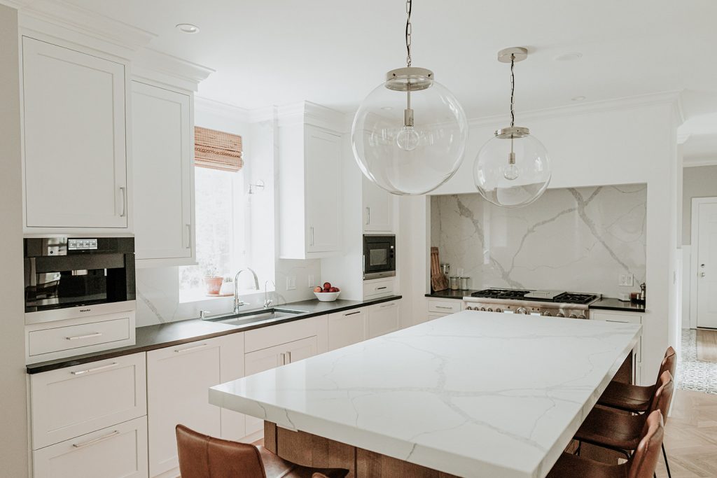
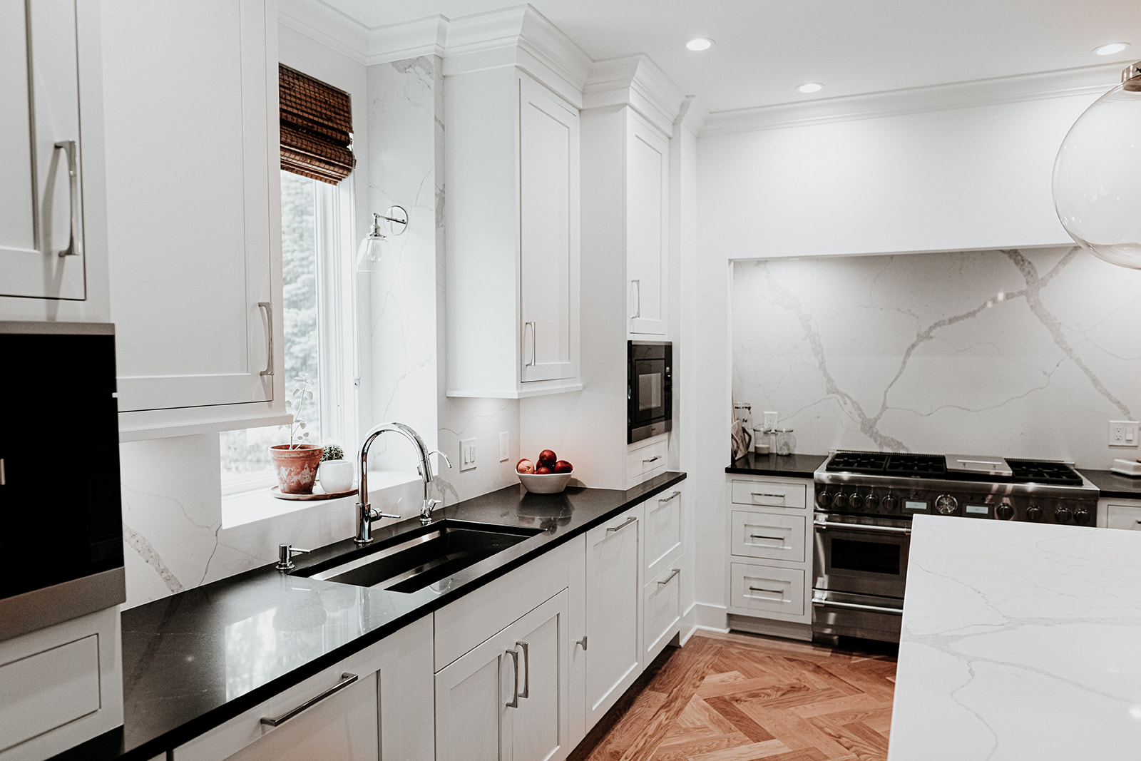
In order to work with fully integrated appliances, our cabinet specialists designed the kitchen using 3 types of construction; inset, full overlay, and full access. Due to the fact that we were working with inset construction of the cabinetry, fully integrated appliances needed decorative panels to not disrupt the overall aesthetic of the space. On the sink side is a blend of full overlay and full access construction concealing a vast array of kitchen appliances too avoid the space from looking busy or cluttered.
Our client knew exactly what she wanted down to specific location of dividers, inserts, and pullouts. She was prepared down to the minute details, knowing the exact purpose for where she wanted items in her kitchen as she listened to our suggestions. Every accessory’s location in this kitchen was thoroughly analyzed and selected for her and her family’s needs.
Bringing It All Together
We created the island as large as we possibly could while still maintaining appropriate walk-way clearances. The island was built using a quarter sawn oak and finished with a light stain to complement the herringbone white oak floor that was newly installed. We also added cabinetry in the dining room to match the style of the kitchen perimeter to facilitate continuity of design.
The rich dark quartz color on the perimeter countertops of the kitchen contrasts playfully with the and the overall clean white aesthetic of the room. The backsplash material used is a quartz that mimics marble in its color and obvious vein pattern while having increased durability and performance in comparison. Quartz was also used on the island countertop, however, we doubled the thickness because we wanted to create a more proportional look due to the island’s heavy duty appearance and size.
The Final Look
Like what you see? We can make your vision happen.
Our team of cabinet, flooring, and countertop specialists will coordinate to make every space in your home feel like home.
